True Palette
Good Habits, Please!
When I first started painting with oils, I was a mess. Clothing was spattered with smeared finger wipes and strange blobs of greasy color. It must have been the Oil Paint Goblin. This colorful little devil taunted me back then, covering supplies (my own and neighbors), clothes and exposed skin. And the spreading mess wasn’t just with paint. I tripped over easel legs in the crowded classroom, talked too much and generally annoyed the other more experienced painters who seemed to be calm and centered, swishing deftly at their canvases.
It took some time to develop the sound habits of oil painting that brought me to that more serene place I prayed existed, even for me. No claims here about mastering some Zen-like composure when I create, but thoughtful habits have tempered my bumbling and served me well. “Develop good habits” I was told early on or “resolve to change bad ones”. Richard Schmid’s book, Alla Prima, Everything I Know About Painting, http://www.richardschmid.com/, has a list of things that will prevent a painter from being successful. That list includes a “wobbly easel”, “faking it” and “showing off “. Schmid’s book makes me smile as he shares his insights and beautiful images.
Choosing paint is important but deciding where to lay it on your palette is one of the most useful habits to embrace. And the earlier you pick your color spots the better. Unlike working with acrylics, oil paints remain moist and workable for hours or even days. They cannot be remoistened like watercolors but they can be covered and reused. Most students are stingy with their oil paints, believing they are costly and should be used with miserly care. With the advent of online art suppliers, this is no longer the case. Painting is about using paint. Buy excellent quality and use them generously. Don’t worry, it is difficult to use more than a few dollars of paint on a canvas unless you are painting really large works.
Stout or Butter?
Each brand of paint has its own character. The viscosity (stiff to buttery) will differ from brand to brand. Try lots of brands. Experiment and discover what makes you and your brushes happiest. This is very important work. I talk about this in Brush Daily. You are the master of your tools and supplies. Fall in love with them. Share your experiences and supplies with other painters or ask instructors if you can try their brands. Buttery is my preferred texture. Mmmmm. I want to feel like I could roll around in my paints. Stiff is good for layering. Have fun figuring this out. You will know when you hit the right combination.
Less Colors, Best Quality
Pigment is the color in your paints. Generally, the most expensive paints have less binder and more pigment than student grade paints or lower cost paints. It is my experience that you “get what you pay for” in paints (like brushes). Buy the best. You never know when you will knock out a beautiful painting. I promise, you do not want to have your colors fade or crumble off your painting because you had an Ebenezer moment while buying supplies. You are worth it.
Where you can save money and confusion with oil paints is by limiting the number of colors you use. This is a good thing for several reasons. First, it keeps things simple. Simple is good. Barry John Raybould, https://www.internationalartist.com/resources/virtual-art-academy, claims there are more than 700 insights needed to create a masterpiece. Whew. I believe this to be true, so anything that simplifies painting is a very good thing. Less to buy, remember to pack, carry and squeeze out onto the palette. And fewer colors will force you to learn to mix color. This a very handy skill to have, seriously. Color mixing takes time to master, but it is big fun. I’ll write about that another time.
Here is what I use:
Warm and cool yellow, warm and cool red and surprise!…warm and cool blue. Then white and maybe a modifier like burnt sienna, raw umber or violet. Here is a little sketch, but keep reading, the list is at the end.

Laying It Out There
This next step involves the most important decision you will make as a new oil painter. When you look at your palette, you need to decide where to place your pigments. Take your time, this is important. Once you decide, you never, ever, want to change this. Ever. That is a pretty strong claim, but it is true. Rules can be broken, but truths are just true. This particular truth is kind of an absolute, so as rebellious artists, this might seem uncomfortable for you to believe. However, bend your rebellious nature to it!
Here’s why you must. Your brush that you absolutely adore, after lots of practice, will know where your paints are on your palette if you don’t move them around. Just like a wandering Labrador, your brush will find its way back to its home color. Over time that brush you are now one with, will magically find the color you need without you thinking about it. Your eyebrows might be heading toward your hairline right now or crinkling together or both. I am not making this up. You want to be able to not think sometimes when you paint. More on this in another post.
An Almost Charming True Story
One time, I swear I had forgotten to put out a color on my palette. My brush went to hit that pile and came up empty. That was when I noticed the missing paint. I am not making this up. For you skeptics, this is how that experience was explained to me. When a pianist plays the piano, the keys are always in the same place, right? What if those keys were moved around each time the musician practiced? Not good, right? Think paint is my keyboard. I want to make beautiful color notes with my paint. No moving those colorful key piles around. Okay?
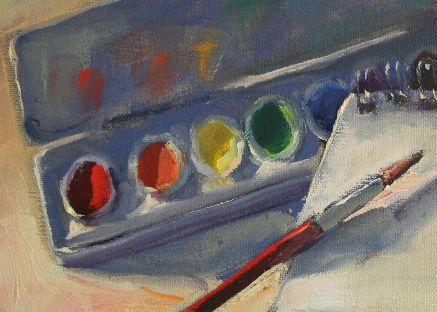
I put my paints around my palette in a rainbow. You can put yours anyway you want. Matt Smith, American Master, http://mattsmithstudio.com/, was my first famous teacher. He recommended this layout even though it is not how his paints are organized. He said if he could do it over, this is how he would lay out his paints. He recognized the cost of changing a well formed habit. I am not a genius. But I am teachable. I was a new painter when I heard this man teach. When someone really amazing gives me a nugget of brilliance, I will snatch it. By the way, I just passed on someone else’s brilliant moment. For free.
So here is my palette:
The List:
Water soluble brands I use:
Holbein (great pigments, but titanium white is very stiff)
Lucas (very buttery, reasonably priced but pigments are less potent)
Grumbacher
Windsor-Newton
Colors I use in my basic palette:
Cadmium Yellow Light (cool)
Cadmium Yellow Medium (warm)
Cadmium Red Light (warm)
Alizarin Crimson (cool)
Ultramarine Blue Deep (warm)
Cerulean Blue Hue (cool)
Titanium White
Expanded palette has all the above and these:

Yellow Ochre
Cadmium Orange (saves time mixing)
Thalo Red Rose
Cobalt Blue
Modifiers (pigments that dull other colors):
Raw Umber
Burnt Sienna
Mauve/Violet Blue
A note about reds. The only pigments that I would spend an extraordinary amount to purchase are reds. There are many very beautiful reds that mix in subtly different ways. Very yummy stuff, so learn to mix your basic colors first. Really. My favorite red of all time? Thalo Red Rose. It literally blossoms when mixed with white. More about Reds later.
Go forth and make beautiful blooming music out there. Ready?
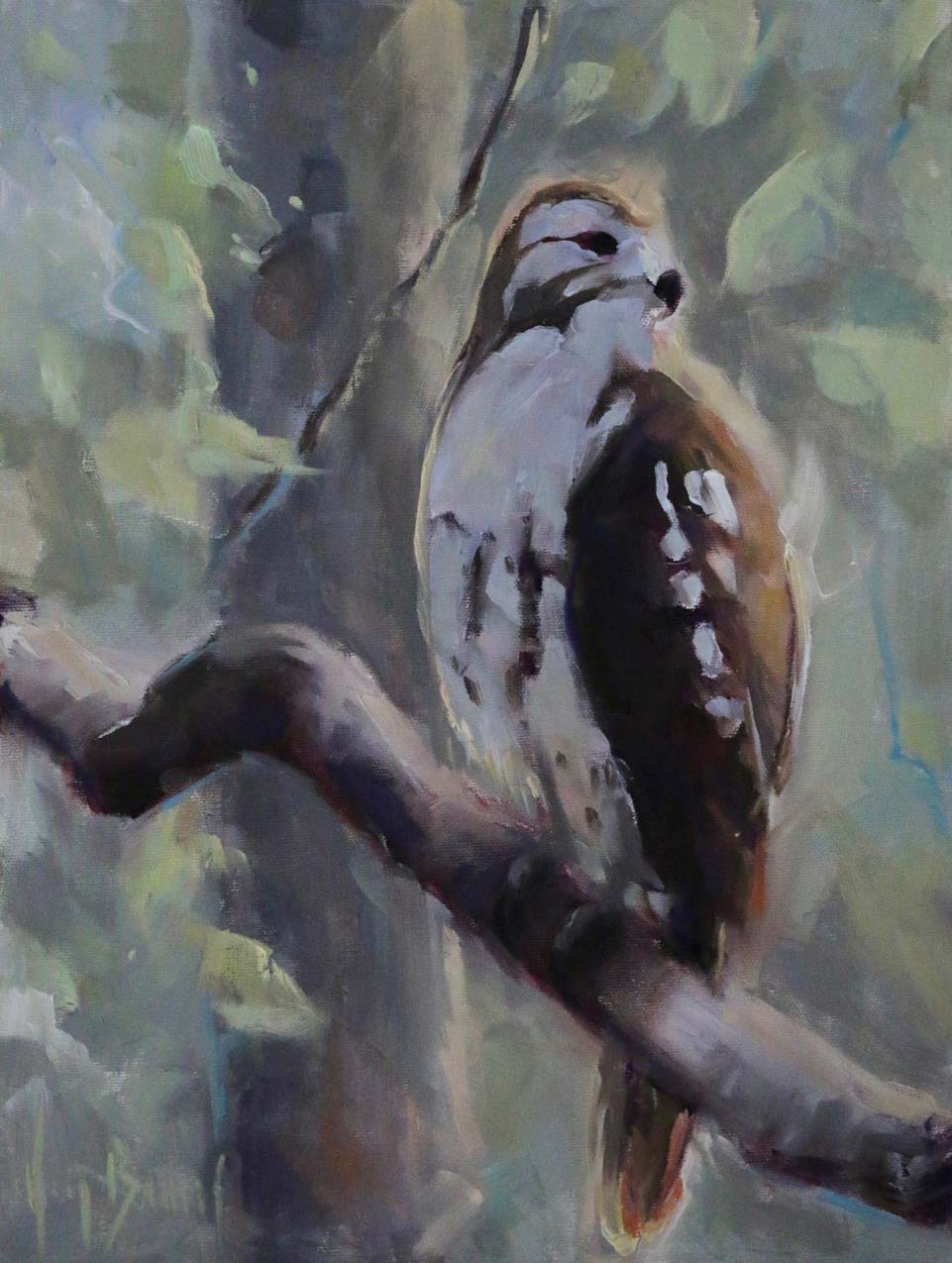
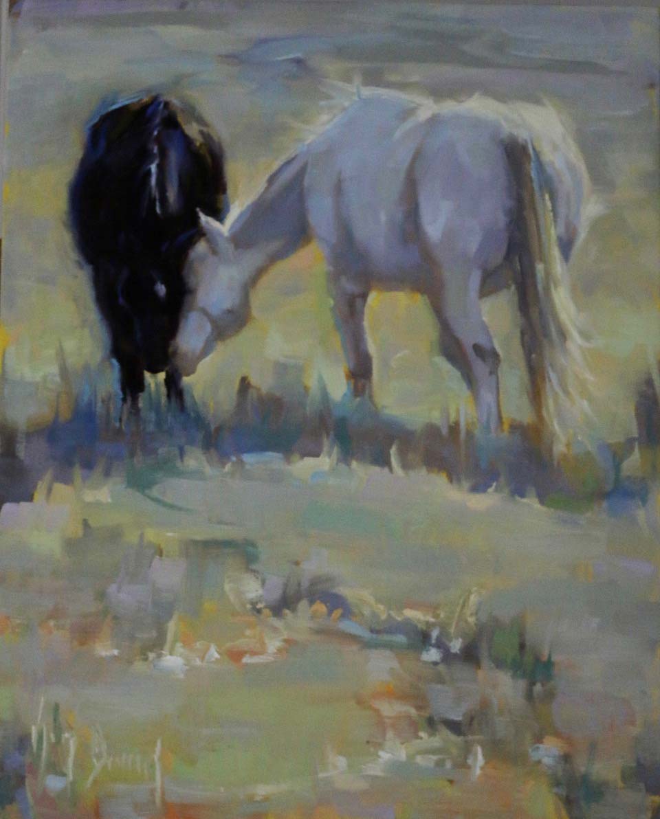
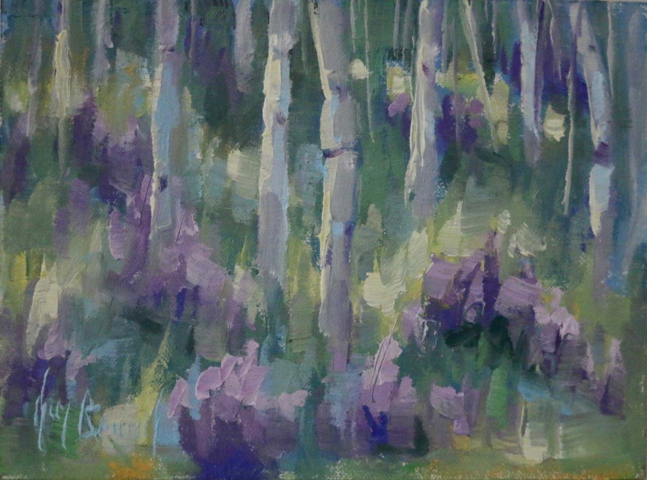
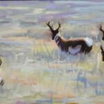
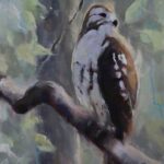
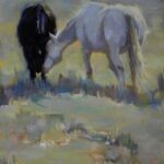
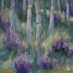
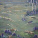
RECENT PAINTINGS