Powerful Neutrals Video
Welcome to the Alive with Light V-Toolbox.
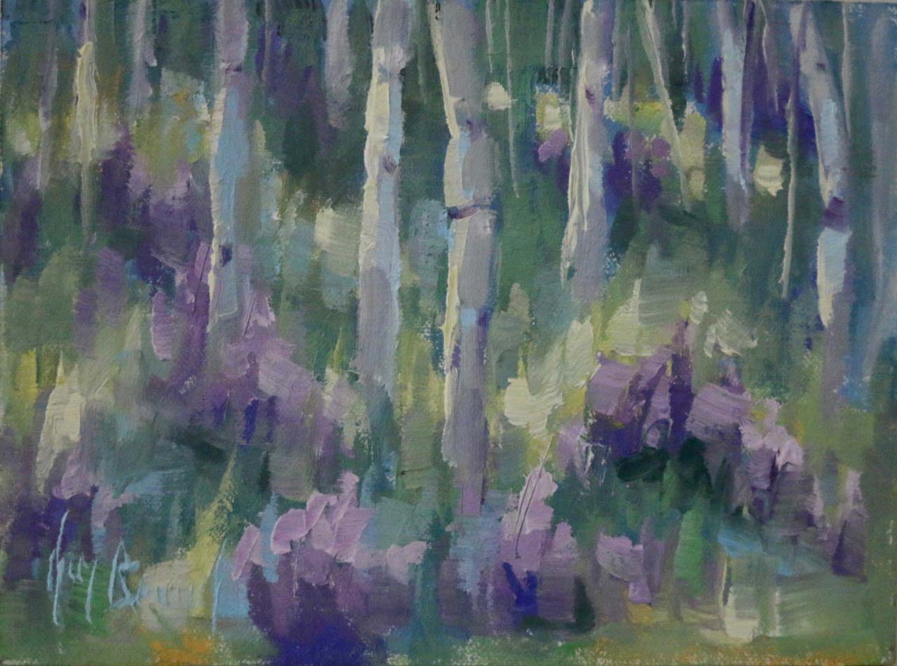
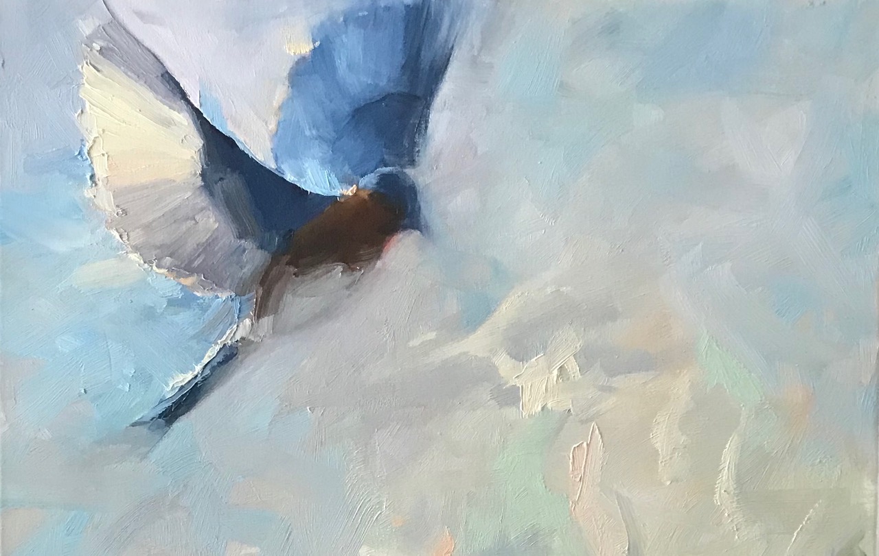
This is the first in a series of insights into sophisticated color mixing. It is important to start with neutral colors as they are both the most neglected and powerful colors when used wisely to create successful paintings. Unfortunately neutrals have been miss labeled as chalky, muddy, muted or even ugly colors. Because color is always relational there are no ugly or wrong colors only color misplaced or next to another color that is not sympathetic. Colors that clash or deaden the colors next to them will feel wrong to the viewer. Companion colors, ones that do play well together often pair potent color with a neutral. Visualize a great grey sea with bright red buoy. That is the power of neutral.
The short Toolbox video Powerful Neutrals contains three paths for quickly mixing neutral colors. By combining complementary colors, red-green, blue-orange, or yellow-purple, then adding white, a range of beautiful neutrals can be created ready to lay-in next to potent colors designed to be the striking moments of an artwork. Neutrals also play an important role in achieving moody and atmospheric effects in landscapes. Fall in love with these important colors on your palette.
Refer back to this video as a refresher whenever you find yourself baffled by a dull lifeless painting. Of course the best way to learn to mix color is by practicing in a workshop or in your studio.
Until next time, happy painting.
Kim

